ENLACES RELACIONADOS: FACEBOOK | INSTAGRAM
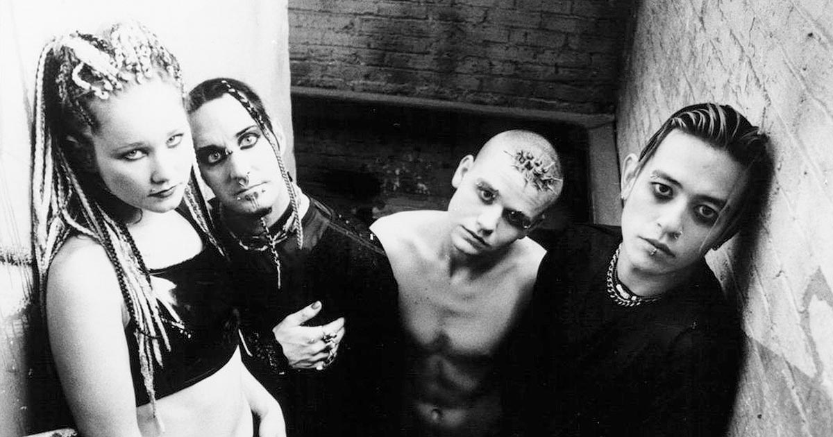
Axel Hermann es el nombre de la persona con la que tenemos el placer de inaugurar esta nueva sección de La Estadea.
Con una dilatada carrera – casi 30 años, como podrás leer en la entrevista que encontraras unas lineas más abajo – y con un estilo directo y saturado, generoso en detalles y muy ligado a la imaginería que rodea al terror, la ciencia ficción, y por supuesto al metal.
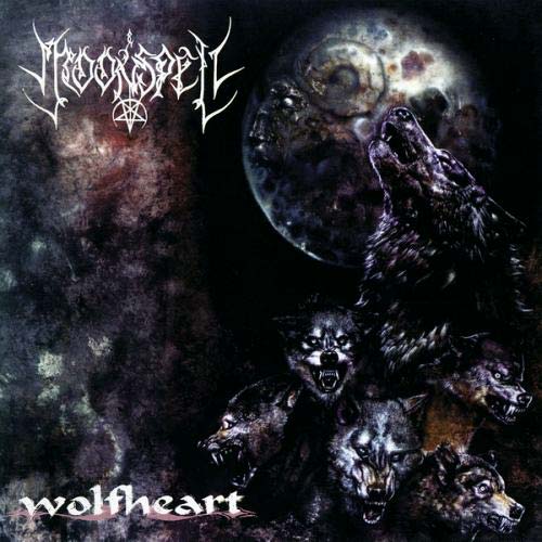
Su trabajo, y el hecho de que bandas de primer nivel cuenten con él para el diseño de sus carpetas, hablan por sí mismos. Asphyx, Iced earth, In flames o Sodom son sólo unos pocos nombres lanzados al azar de entre todos con los que se ha codeado este artista.
Sin más preámbulos, y con la emoción que supone tirar de una nueva sección para adelante, aquí os dejamos con la entrevista que nos concedió Axel Hermann.
¿Cuando y cómo fue el momento en que sentiste que el mundo de la ilustración te apasionaba tanto, que querías hacer de él tu profesión?
Mi pasión comenzó cuando tenía alrededor de cuatro años. Mi padre es también un ilustrador independiente y solía estar en su estudio todos los días y le veía dibujar. Así que cuando empecé a dibujar ya nunca dejé de hacerlo.
Fue a finales de noviembre de 1988, mientras visitaba una escuela de arte local en Dortmund, cuando tuve la oportunidad de reunirme con Robert Kampf, que hacía poco tiempo había empezado su propio sello discográfico, Century Media Records, en su propia casa. Un compañero mío de clase acababa de terminar la portada para la banda de Robert, Despair. El título del disco era ‘History of hate’. Otro tío de mi clase organizó la reunión con Robert. Cuando finalmente nos conocimos, encajamos bien y los resultados de esta colaboración son afortunadamente, aún a día de hoy, muy bien recibidos.
«Cuando diseñar portadas para bandas de metal se convirtió en una vía para desarrollar una carrera artística, todas las otras opciones desaparecieron del mapa»
¿Eres autodidacta, o has recibido algún tipo de formación en alguna escuela de arte o de otro tipo?
Soy completamente autodidacta. Mi intención era ir a la escuela de arte, quería estudiar arte y diseño… pero cuando diseñar portadas para bandas de metal se convirtió en una vía para desarrollar una carrera artística, todas las otras opciones desaparecieron del mapa.
Todos los diseños, desde Morgoth, Unleashed, Grave, Asphyx, hasta Iced earth fueron realizadas en “modalidad de prácticas”. Nunca había pintado ni aerografiado antes. Era todo bastante crudo e inocente para empezar. Algo así como “contra todo pronóstico”.


¿Cuales han sido las influencias más importantes a la hora de desarrollar tu estilo, tanto fuera como dentro del mundo de la ilustración?
Las influencias que más me han marcado son las de los viejos maestros de la ilustración del cómic. Por ejemplo John Buscema y Barry Windsor-Smith (Conan); Neal Adams (Batman); y por supuesto Bernie Wrightson. Su habilidad para crear imágenes y personajes realmente oscuros y siniestros con sólo el uso de tinta ha tenido una influencia directa en mi estilo de dibujar. Y luego, por supuesto H.R. Giger, que nos ha influenciado a mi y a Morgoth para sus dos primeros EP’s. ‘Resurrection absurd’ y ‘The eternal fall’.
«Desde que la ilustración digital es la única opción cuando son necesarias correcciones rápidas, estás en peligro de perder tus capacidades en las habilidades relativas al uso de métodos clásicos»
¿Hay alguna técnica con la que te guste más trabajar?
Por encima de todo lo demás, el papel y lápiz siempre será mi primera opción. Desde que eclosionó mi carrera, hace cerca de 28 años ya, todo empezó con el lápiz y solamente cambié algo en los noventa, con el uso de aerógrafo y acrílico; y actualmente con el dibujo digital combinado con otros recursos. Desde que la ilustración digital es la única opción cuando son necesarias correcciones rápidas, estás en peligro de perder tus capacidades en las habilidades relativas al uso de métodos clásicos. Así que siempre permaneceré fiel al uso de lápices y pinceles para combinar los elementos tradicionales con las herramientas digitales. Y siempre mola poder coger y mirar un artwork físico y no sólo un archivo almacenado. Tengo el aerógrafo excluido… el último que hice fue a petición, para el diseño de ‘Chalice of ages’ de la banda Deathvokation.
Descríbenos un poco el proceso que sigues desde el momento en que te pones manos a la obra en el desarrollo del artwork de un álbum. ¿Tienes un método de trabajo definido, o dependiendo de algunos factores lo abordas de diferentes formas?
Para un artwork siempre empiezo de cero. No hay una fórmula para crear una carpeta con características individuales. De otra forma corres el peligro de crear una especie de “stock de arte”. Todo depende de lo que quiera una banda, si ya traen un concepto definido, o tengo que buscar ese riff o esa atmósfera en su música, que explique el concepto de la banda para mi. Luego, por supuesto, empiezas con la comunicación habitual entre las partes, envío de bocetos, ir progresando y refinando el concepto del dibujo, etc.
De todas tus obras, ¿hay alguna que tenga alguna connotación especialmente significativa para ti?
Hay unos pocos. Pero ‘Crush the cenopath’ de Asphyx es ESE artwork al que tengo más aprecio… muchos de mis otros artworks los odié durante años, porque en mi opinión, no eran suficientemente buenos (es una larga historia… ;))
‘Crush the cenopath’ resume cada aspecto de mi furia y de la agitación interna que tenía en ese momento. El caos para crear algo de la nada, sin ninguna pista ni concepto. En ese momento tenía un pequeño estudio dentro de las oficinas de Century Media. Cuando empecé a trabajar, estaba de muy mal humor, avisé a todo el mundo de que ni pensasen en llamar a la puerta de mi estudio si estaba cerrada y después me puse a pintar. El diseño lo acabé en sólo una noche… y mi humor mejoró.
«‘Crush the cenopath’ (Asphyx) resume cada aspecto de mi furia y de la agitación interna que tenía en ese momento. El caos para crear algo de la nada, sin ninguna pista ni concepto. En ese momento tenía un pequeño estudio dentro de las oficinas de Century Media»
Según mi opinión, a día de hoy, el artwork de los álbumes ha alcanzado un mayor protagonismo y un mayor nivel del que nunca tuvo… ¿estás de acuerdo con esta apreciación?, ¿por qué crees que esto se produjo?. Si no estás de acuerdo explícanos un poco porqué…
Estoy completamente de acuerdo con eso. Desde que el streaming se convirtió en un aspecto importante para conseguir que el público escuche o conozca tu música, se ha vuelto más difícil para las bandas la venta de copias físicas. Así que una buena portada se ha convertido – de nuevo – en un motivo importante de ventas. Personalmente adoro las presentaciones de las grandes compilaciones, o de las ediciones limitadas con temas añadidos combinados con un gran artwork. Incluso el vinilo ha reclamado su bien merecido lugar.
¿Cuanto crees que aporta un buen diseño artístico a la hora de que una banda llame la atención de un público sobrestimulado, todo en un marco como el actual, en el que hay tanta oferta musical en todos los estilos?
Ahora es muy distinto de cuando empecé (retomando aquellos días, incluso la posibilidad de escribir un e-mail era completa ciencia-ficción, jaja). Hoy en día, el gran número de bandas, y por otro lado, el inmenso número de talentosas y exitosas bandas de versiones… se ha convertido en algo mucho más difícil el diferenciarse y tener tu propio sello de identidad. Así que mi opinión personal, es que sólo puedes competir con el aumento de tu calidad. Y eso incluye mis pensamientos sobre mi respuesta anterior.
La música muchas veces sugiere imágenes en nuestro subconsciente, y algunas personas son capaces de concretar estas imágenes en el papel. Seguro que algunas vez has fantaseado con el artwork que tú hubieras hecho para alguno de tus discos favoritos. ¿podrías decirnos uno de ellos y qué hubieras hecho en su diseño artístico?
¡Sería ‘Creatures of the night’ de Kiss! Que incluía a Vinnie Vincent, y lo haría en un estilo similar a ‘Destroyer’.
¡Pero para eso sería mejor incluir un boceto!
¿Qué consejo le darías a cualquier persona que está empezando, pero que cree que no tiene el talento necesario o no tiene el apoyo suficiente en su entorno?
Primero y fundamental: “Si tú no crees en ti mismo y en tus habilidades… ¿por qué van a creer los demás?” Todo empieza desde ahí. Se sencillo. Si piensas que tienes algo de valor, comienza a trabajarlo de forma local, métete en el underground y hazte notar… como cualquier banda se ve obligada a hacer. Educa tus habilidades. No te eches atrás… ¡NUNCA! Desde que existe Facebook y demás servidores de contacto social, es mucho más sencillo ponerse en contacto con las bandas y los sellos. Y si no tienes éxito en el primer intento, vuélvelo a intentar. NO tienes nada garantizado. Incluso después de 28 años, y sé de lo que estoy hablando :), pero nada tiene comparación (todavía) con sujetar en tus manos tu propia portada de un producto acabado.
«Desde que el streaming se convirtió en un aspecto importante para conseguir que el público escuche o conozca tu música, se ha vuelto más difícil para las bandas la venta de copias físicas. Así que una buena portada se ha convertido – de nuevo – en un motivo importante de ventas»
Nombra a unas cuantas bandas que estén habitualmente sonando en tu reproductor.
Últimamente tiendo a escuchar bandas con las que crecí. ¡KISS siguen siendo una gran parte de mi vida! Soy seguidor desde 1979. WASP también pasan a menudo por el reproductor de mi casa. Por supuesto Asphyx, el ‘Hammerheart’ de Bathory es uno de mis favoritos de todos los tiempos. Siempre es buena elección y da igual del humor que esté… desde ‘Secrets of the moon’ hasta ‘Vintage trouble’. Esta mañana fue Gary Moore y su ‘Victims of the future’ lo que escuche antes de ir a trabajar ;)
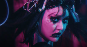
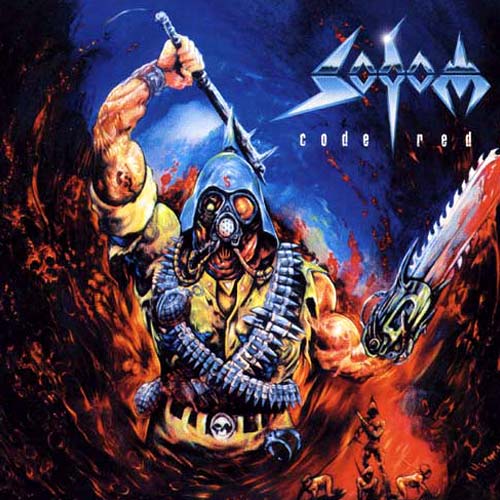
Háblanos un poco de esta obra, en que te inspiraste, la técnica empleada, el tiempo invertido, el feedback con la banda, si hay alguna anécdota a su alrededor…
Esta es mi décima portada para Asphix, y la primera para la que hice algunas variaciones una vez estaba terminado. Los miembros de la banda y yo discutimos acaloradamente sobre el concepto general. Yo no quería repetir ‘Deathhammer’ y sugerí cambiar el tono general del colorido a un estilo más agresivo. Pero en retrospectiva, se iba demasiado lejos.
Todos queríamos que la portada fuese un paso más allá de las últimas, y coincidíamos en los términos de perfección y calidad. Me llevó varias semanas completarlo. Cambiando continuamente personajes y detalles (y nada de copiar y pegar, redibujando de verdad, etc).
Me negué completamente a retratar a un/una anciano moribundo en su lecho de muerte. Así que opté como argumento por cementerio viviente, donde las víctimas son perseguidas eternamente por sus pecados y sus temores. Hay un montón de personajes colocados en este extraño entorno: el moribundo temeroso; el yonki; el torturado; el mártir; aquellos que nunca pedirán perdón y son bendecidos y transformados en un demonio, por un demonio. Y por último, pero no menos importante… el sacerdote pedófilo… él es el único que todavía reivindica sus propias mentiras y es el único que no aparece corriendo, si no que permanece en pie para siempre, congelado en su estado de delirio.
La portada no lleva una gran carga de sutileza, el concepto es más impactante y directo, a pesar de todos sus detalles.
ENGLISH VERSION
Axel Hermann is the name of the person with whom we have the pleasure of start up this new section in La Estadea.
With a very long career – almost 30 years, as you can read in the interview that you will find a few lines below – and with a direct and saturated style, generous in details and very close to terror and science-ficction imaginery, and of course, to metal.
His work and the fact that top bands count with him for the design of their artwork, tell us about his status. Asphyx, Iced earth, In flames or Sodom are just a few randomly picked names among another great number of bands that worked with him.
Without further ado, and with the excitement of pulling a new section forward, here we leave you the interview that Axel Hermann give to us.
How and when was the moment in which you meet with your passion about the huge world of illustration and making this your way of living?
I met my passion when I was around four years old. My father is an freelance illustrator as well and I used to hang around his home studio every day and watched him draw. So when I started to draw myself I never stopped. It was at the end of november 1988, while visiting a local artschool in Dortmund, when I got the chance to meet up with Robert Kampf, who recently started his own label Century Media Records at his home office. A classmate of mine had just finished the first coverartwork for Robert’s band Despair. The record’s title was “History Of Hate”. Another guy in my class set up the meeting with Robert. When we finally met, we got along pretty well and the results of this collaboration are even today thankfully well received.
Are you a self-taugh person or did you take lessons at an art-school or any other kind or education?
I am completely self taught. Intentionally I wanted to study artschool I wanted to study art and design… but when designing artworks for metal-bands became a career-option, all other options were off the radar.
All artworks – from Morgoth, Unleashed, Grave, Asphyx to Iced Earth were all done on an “on the job training”-level. I never had painted or airbrushed before. It was all pretty much raw and naiv to start with. Something like “against all odds”.
Which are the most important influences in the develop of your personal style, both in and out of the world of illustration?
I was always heavily influenced by the grand old masters of comicbook-illustrations. For excample: John Buscema & Barry Windsor-Smith (Conan), Neal Adams (Batman) and of course Bernie Wrightson. His abillity to create really dark and sinister images and characters only with the use of ink had a direct influence on my style of drawing. Then of course H.R. Giger, which influenced me and Morgoth for their first two EP’s “Ressurection Absurd” and “The Eternal Fall”.
Do you have any special technic you love to work with above the others?
Above all else, pen and paper will always be my first option. Since my career spawns now close to 28 years, it started from pencils only to airbrush and acrylics during the ninetees and to digital drawing/painting combined with mixed mediums in recent times. Since digital illustration is by far the only option when it comes to fast adjustments, you are well in danger to loose tracks on abillities in regards to the “classic” use of mediums. So I always will stick to using pencils and brushes to combine both traditional and digital tools. And it is always cool to still hold and look at a real artwork, not just a file stored. Excluded is airbrush… the last one I did on request was designed for Deathevokation’s “Chalice Of Ages”.
May you describe us the entire process you follow in the creation of any album’s artwork. Do you have a predefined method or do you follow different ways depending on other external factors?
For an artwork I always start from scratch. There is no real formula to create an artwork with individual characteristics. Otherwise you become endangered to create some kind of stockart. It depends on what a band wants if a concepts already exitsts on their side, or I will search for that particular riff or atmosphere in their music, that explains the whole concept of the band for me. Then of course, you will start with the usual procedure of communication. Sending scetches, refined and progressed concept drawings, etc.
Among all of your works, is there any of them with a special personal meaning for you?
There are a few. But “Crush The Cenotaph” for Asphyx is THAT artwork that I hold most dear and close… Most of my other artwork I hated for years, because in my opinion they were not good enough. (Long story;))
“Crush” sums up every aspect of my anger and inner turmoil back then. The chaos to create something out of nothing, without any clue or concept. At that time I had a little studio within the CM-office building. When I came to work, I was in a really bad mood, warned everybody to not even to think about to knock on the locked door to my studio and then just started painting. The artwork was finished in one night only… and my mood got better.
In my opinion, the artwork nowadays is more important than ever in the music world, and has by its own right the highest level in many years. Do you agree with this opinion? If you think so, in your experience, what’s the reason for this?. Or if you don’t think so, tell us the reasons why.
I do agree on that completely! Since streaming became a major aspect of getting the fans to listen to / or introducing the to your brand of music, it has become more difficult to sell a physical copy of one bands record. So a good coverartwork has become – again – a major sales argument. I personally love a great compilation or limited edition packaging with additional tunes combined with a great artwork. And even vinyl has reclaimed its well deserved spot.
In these days of overstimulated people and the continuous growing number of bands out there… How high is the value of a good artwork to catch peoples’ attention on a band?
It is very different compared to the times when I started. (To remember that way back in the day, even the possibility of writing an E-Mail was complete science fiction, haha.) Nowadays, the increased number of bands and on the other hand the uge number of very talented and successfully active cover-artists… it has become much more difficult to stand out and make your mark.
So it is my personal opinion, that you can only compete with the increase of quality. And that includes my thougts on my above placed answer.
Music suggests images in our own mind, and some of you have the ability to put those images on paper. Sure, anytime you fantasized with making the artwork for some of your favorite albums. Can you tell us one of them and what would have you done for this occasion?
It would be “Creatures Of The Night” from Kiss! Including Vinnie Vincent and done in a similar style to “Destroyer”.
That would better include a scetch!
Tell us some advises you could give to those who are taking their first steps into illustration world but think they don’t have enough talent for it, or don’t feel supported by the people of their daily basis.
First and primary advice.: “If you do not believe in yourself and your abilities… why should others?!”.
It all starts from there. Be naiv. If you think you have something of value, start local… get in the underground and get yourself noticed…like any other band is forced to do. Refine your skills. Do not back down…EVER!!! Since facebook and all forms of social media it has become much more easier to get in contact with bands and labels. And if you do not succeed at the first try, try again. You have NO guarantee for anything. Even after 28 years. (And I know what I am talking about.:) But nothing (still) compares to hold your own cover in your hands clancing from a finished product!
Tell us a bunch of bands that usually sounds on your stereo.
Recently I tend to listen to bands I used to grow up with. KISS is still a uge part of my life! I am a fan since 1979. WASP is as well rotating in my stereo at my place alot. Asphyx of course. Bathory’s “Hammerheart” is one of my alltime favourites. Then its fair game and whatever mood I am in… from Secrets Of The Moon to Vintage Trouble. This morning it was Gary Moore’s “Victims Of The Future” before going to work;)
Tell us something about this work. What was your inspiration, technic used, how much time it toke you to do, the feedback with the band, any funny thing that happened in the making of…
This is my tenth coverart for Asphyx and the first one I did several finished variation for. This time around all band-members and me argued heavily over the allover concept. I did not want to repeat “Deathhammer” and I suggested to change the allover colour tone to a more aggressive style. But in retrospect it was too far out. We all wanted the cover to be taken one step further than the last ones and agreed on terms of perfection and quality. It took me over several weeks to complete the artwork. Repeatedly changing characters and details. (Not copy and paste, but serious redrawing, etc.) I refused flat out to portrait a dying old character on his/her deathbed. So I opted for a “living cemetary”-theme, where the victims are forever being haunted by their sins and misgivings. There are a lot of characters placed in this eerie surrounding. The dying fearful guy, the junkie, the torture-victim, the martyr, the ones who will never ask for forgiveness and are blessed and being transformed into and by a demon. And last but not least… the pedophile priest… he is the one who still claims to his own lies and is the only one who is not running but stands forever being frozen in a stance of delusion. The cover does not bear a huge amount of sublety, but is more like a blunt force trauma… straight in your face, despite all its details.